
Overview
This project began as a simple request to make the “Tow My Car” option more visible in the truck rental flow, based on concerns that customers weren’t seeing or using it. However, after digging into the experience, it became clear there was a broader opportunity to improve the entire reservation process, not just for towing customers, but for anyone booking a truck.
The Challenge
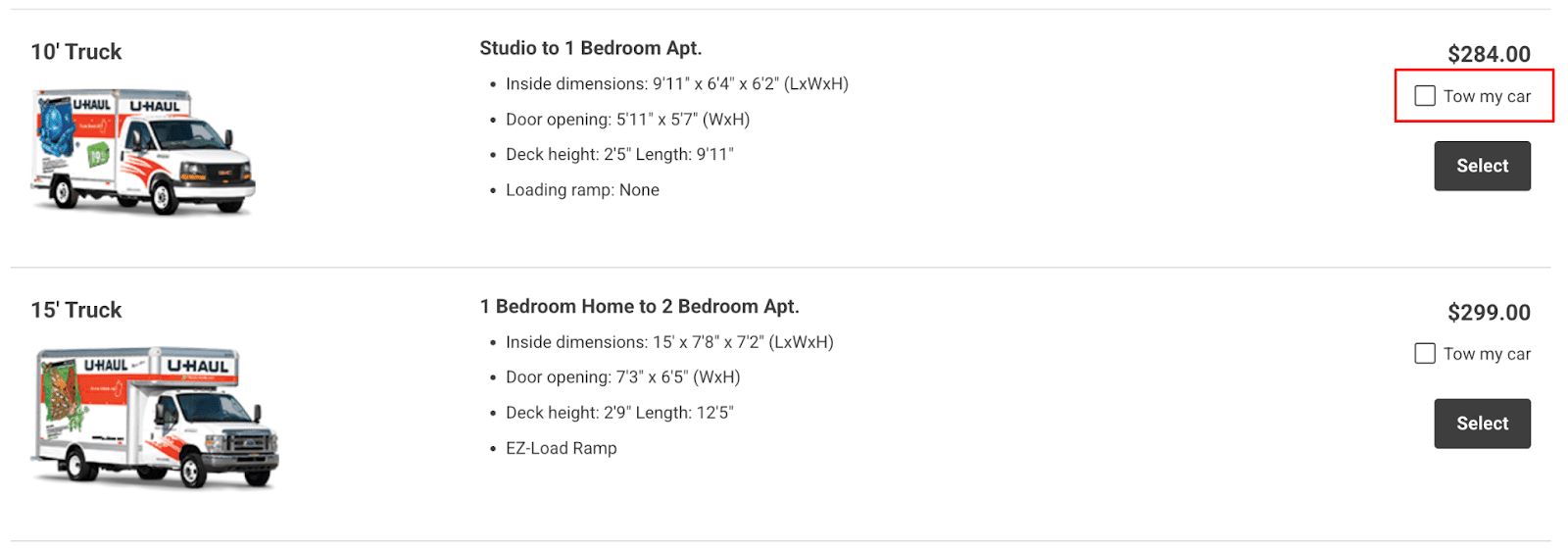
The “Tow My Car” checkbox wasn’t functioning like a typical selection—it redirected users away from the truck reservation flow and into a separate truck and towing combination page. This behavior felt unintuitive and disrupted the user experience.
What started as a visibility concern quickly revealed a deeper issue with how the flow was structured. My goal was to rethink this interaction and create a seamless, more predictable experience for customers considering towing options.
Research
Key Takeaways
- From June 6 to 17, 2025, over 640,000 people visited the Truck Rates Page.
- Of those, 1,873 people clicked “Tow My Car,” meaning they were seeing the option and choosing it. That’s about 0.29% of total visitors.
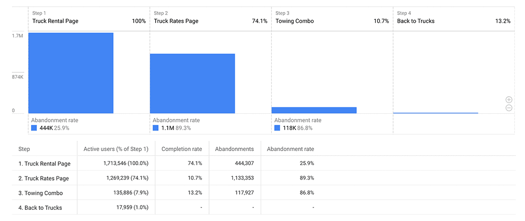
Reservation Journey
- Truck Rental Page > Truck Rates Page: About 74% of users continued. Roughly 26% abandoned at this point.
- Truck Rates Page > Towing Combo Page: Only 10.7% proceeded to the Towing Combo Page. The majority left or made a different selection.
Towing Combo Page Behavior
- 13.2% returned to the Truck Rates Page, suggesting hesitation.
- 86.8% did not return, indicating possible completion, confusion, or abandonment.
Research Conclusion
Customers were finding and using the “Tow My Car” option, but many abandoned the reservation process after reaching the Towing Combo Page. This revealed friction or confusion within the flow itself.
The project evolved from a simple UI tweak to a broader redesign, aimed at:
- Making towing options easier to compare.
- Reducing back-and-forth navigation.
- Improving confidence in combo selections.
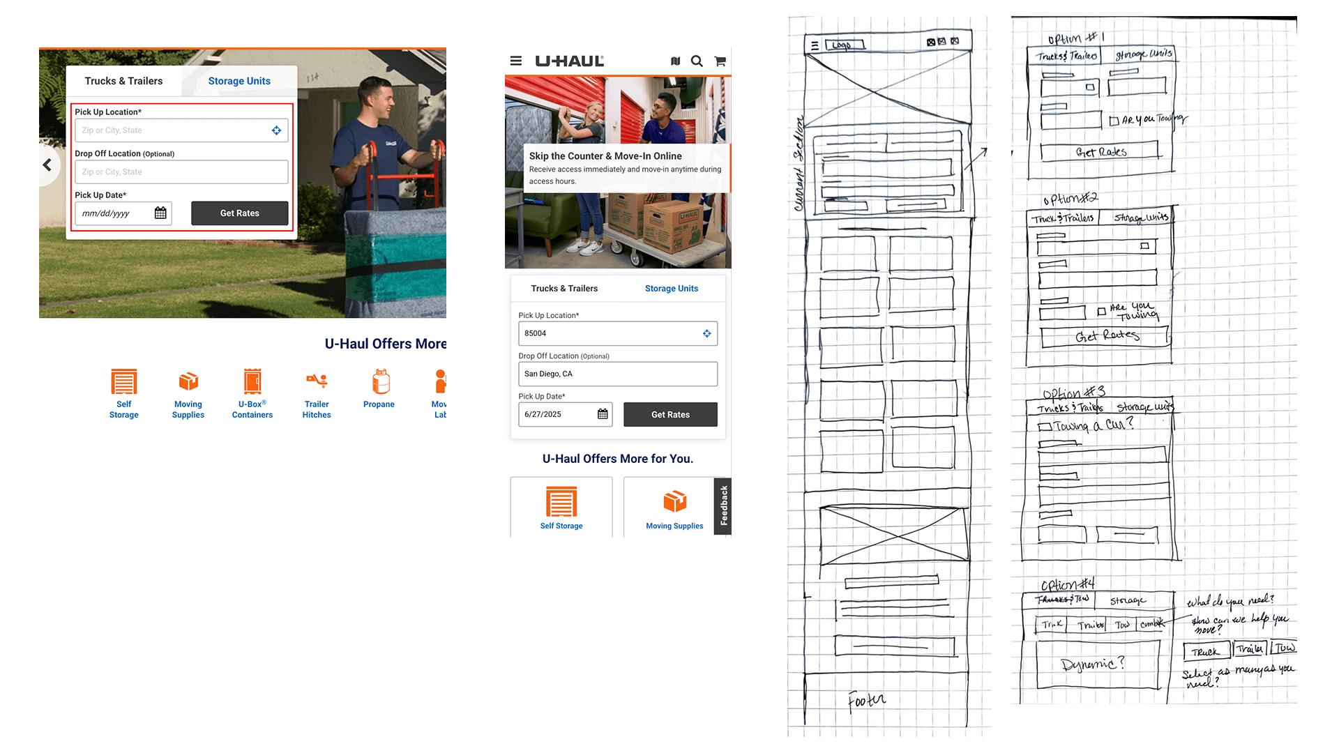
Ideation
To address usability concerns, I sketched the existing mobile layout to map pain points. Users start by entering location and dates. The small “Tow My Car” checkbox on the results page redirects to “Truck & Towing” if selected.
Research showed this abrupt navigation confused users. Some restarted the process or abandoned their reservation.
I explored moving the towing checkbox to the first step, but this didn’t solve layout issues or account for trailers and combinations.
System reviews revealed rental contracts only allow a trailer or a towed vehicle—not both—but either can pair with a truck.
This led to a flexible approach: let users clearly indicate needs—Truck, Trailer, Towing, or combinations—preventing reroutes and dynamically adjusting the form.
Once I shared these concepts with the team, we agreed to advance the idea through wireframes.
Wireframes and Interaction Flow
I created wireframes for mobile, tablet, and desktop to provide a consistent, easy-to-use experience across all devices.
The first example shows the simplest scenario, where the customer only needs a truck. They select “Truck,” which highlights to confirm their choice — functioning like a checkbox. After entering the required details, they click “Get Rates” and are taken to the Truck Selection page, where they can choose the size that fits their move.
For customers needing a combination of equipment, like a truck and a trailer, they can select both options. However, rental contracts do not allow a trailer and a towing device on the same order.
To make this clear, once one of those options is selected, the other is automatically disabled. After making their selections, the customer clicks “Get Rates” and is directed to the correct page based on what they chose — for example, the Truck and Trailer selection page.
Conclusion and Next Steps
After finalizing the wireframes, I collaborated with the business unit to gather feedback and implement minor adjustments to the flow. One point of debate was the removal of an informational banner from the original process, which had sparked mixed reactions internally. However, after reviewing the user journey, I determined the simplified flow provided clearer direction and reduced unnecessary distractions.
With alignment on the wireframes, I transitioned the project to the UI design phase to finalize visual styling and component details.
Once development is complete, we plan to launch the updated experience as part of an A/B test. The primary focus will be measuring whether more users are successfully reaching the towing selection section and whether the revised interaction flow reduces confusion or drop-off. Post-launch, I’ll analyze the data to identify any remaining friction points and recommend further improvements based on real user behavior.
This process ensures we’re not only simplifying the experience but validating those changes with measurable outcomes.